Think of that pitch as less “we put a sticker on your car” and more “we rewrite its personality like a movie villain getting a glow-up.” At a place like Wraptitude, the language is deliberately cinematic because the end result is meant to hit the street like a plot twist.
Here’s what’s really going on under the hood of that message:
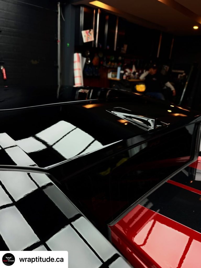
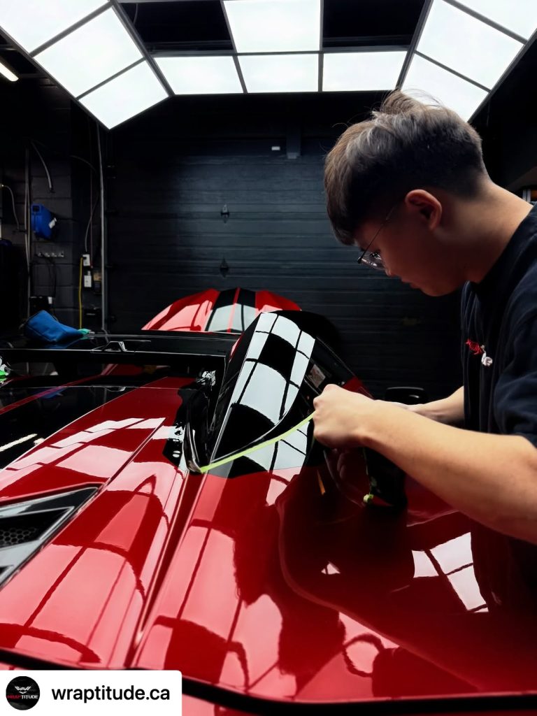
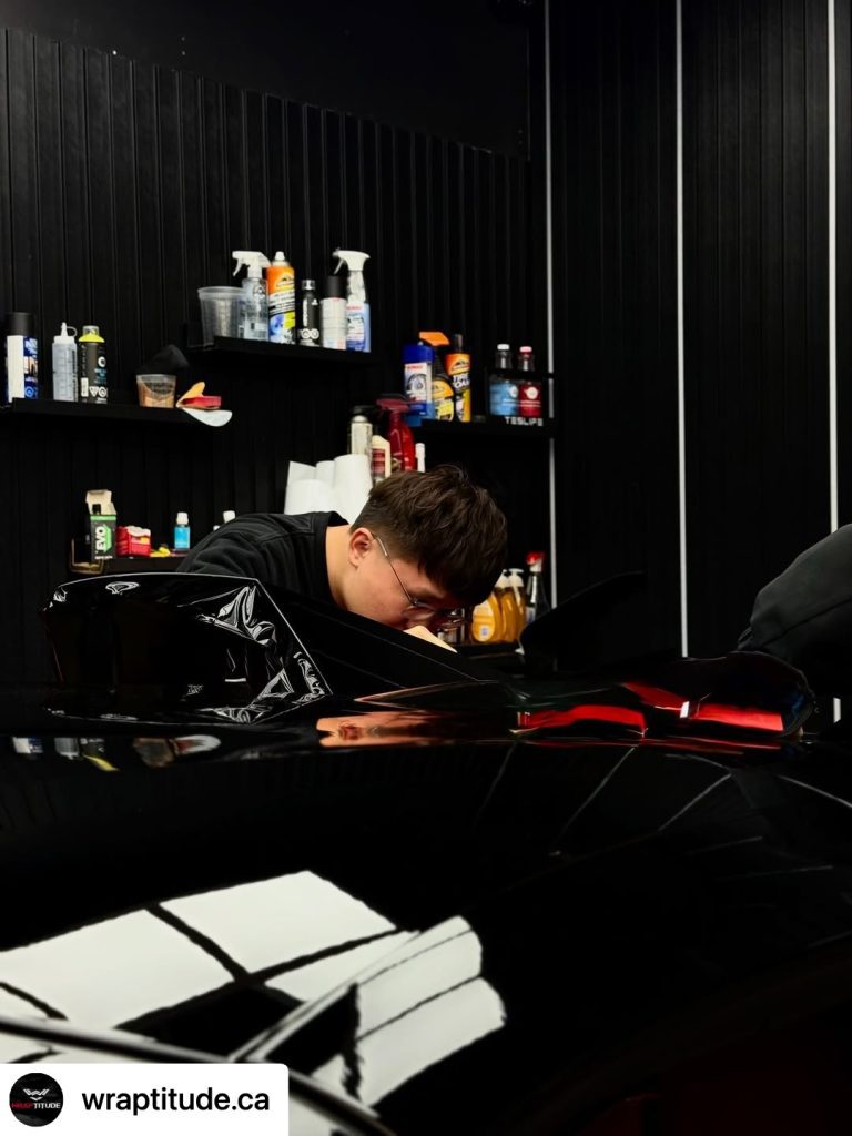
“Custom design”
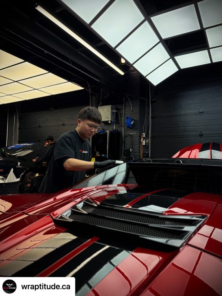
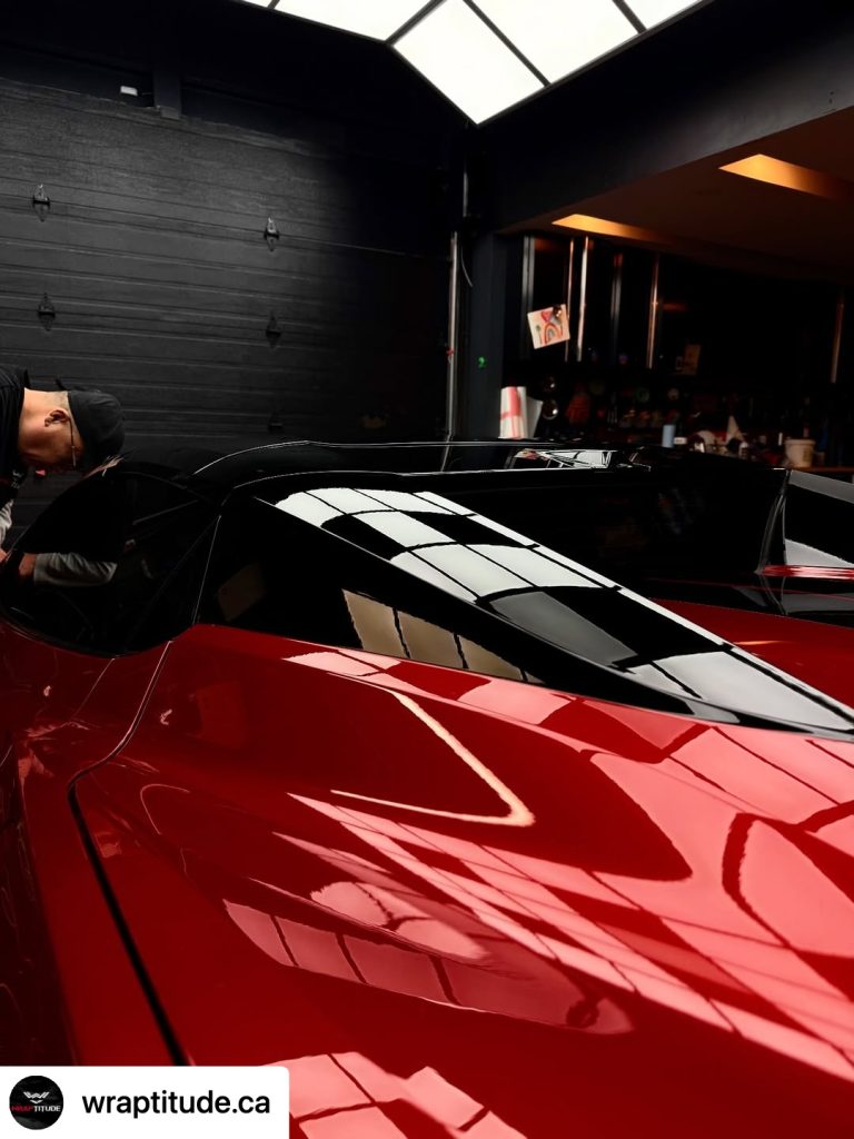
Not just picking matte black vs gloss. This can mean layered vinyl, accent lines that follow the body geometry, or even optical tricks that exaggerate shapes. On a Chevrolet Corvette C8, that’s huge because the car already has sharp, angular surfaces. A good wrap designer turns those lines into visual weapons.
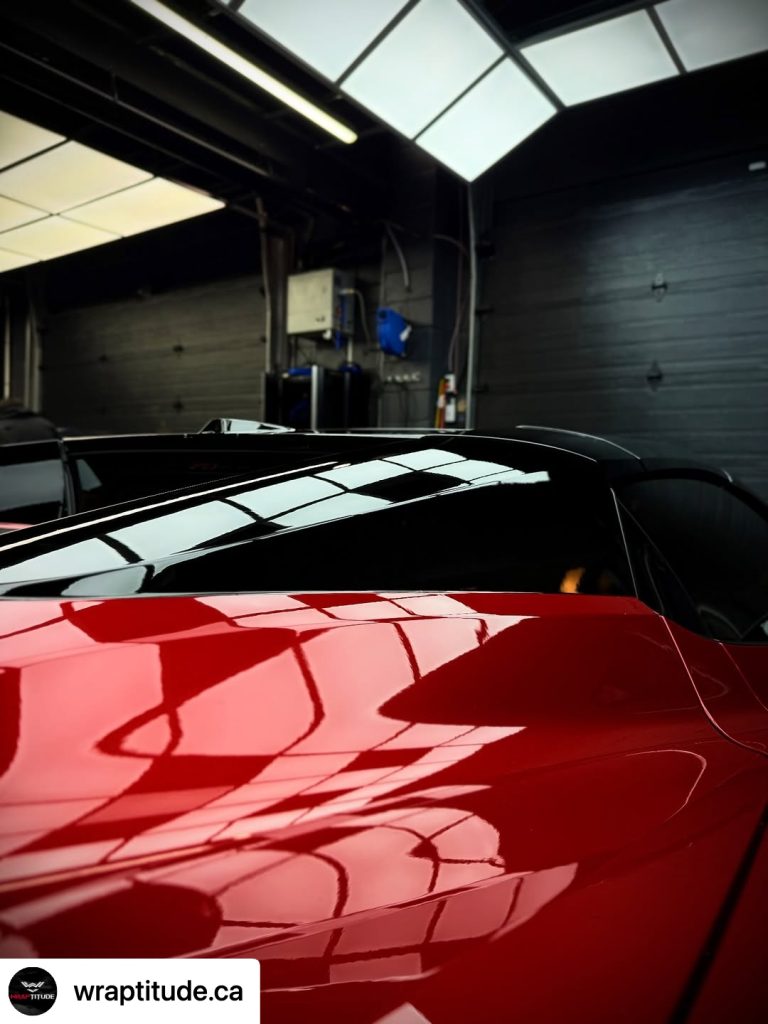
“Sharper contrast”
Contrast is how you control attention. Black roof + lighter body, gloss vs satin panels, or even subtle tone shifts. Your eyes get pulled to edges, vents, and curves. Done right, it makes the car look more expensive without actually changing a single mechanical part.
“Look lower, wider, more aggressive”
This is pure visual illusion engineering. Wrap designers use:
- darker lower sections → car feels closer to the ground
- horizontal lines → visually widen the stance
- shadow gradients → fake depth and muscle
It’s basically Photoshop… but in real life, at 100 km/h.
“Redefine presence”
This is the real product. Not vinyl. Not color. Presence.
When your car pulls up, people shouldn’t just see “a C8,” they should think that one. The wrap becomes identity.